Have you been as eager as I have been for Kiki’s report back on this question??! Well, with no further ado, take it away Kiki!
With all of the Procreate letterers out there, you might start to think that the only way to make really great letters is with an iPad. While I'll agree that working digitally has its benefits, I don't necessarily think it's the best (and it's certainly not the only) way to go. The best lettering artists/typographers I know work almost entirely on physical media - paper, windows, glass, walls, what-have-you - and totally slay.
So now you want to know how YOU can make your non-digital lettering as epic as freaking possible, and I'm going to tell you ALL. THE. THINGS.
First and most importantly: PRACTICE, dammit.
I've been lettering since before anyone called it hand lettering or thought it was a fun hobby. Parties 5 or 6 years ago were always a blast.
Them: "So, Kiki, what do you do?"
Me: "I make hand-drawn typography."
Them: “What’s that?
Me: “I draw fancy letters.”
*blank stares, crickets chirping*
(By the way, this still happens sometimes. Just the other day I had to explain to someone what hand lettering was, and at the end of the conversation they’d decided it was the same thing as calligraphy and I was too tired to care anymore.)
The point is, I've been doing this for a long time. These days at least most people know what hand lettering is. In the meantime, I've had the chance to try all kinds of pencils, paints, markers, gel pens, inks, papers, typefaces, techniques, artistic styles, desks, chairs, lamps, and anything else you can think of. All this trying (and all the fucking up that inevitably comes with it) has taught me a LOT.
Now, you don't have to put in as many years as I have to get pretty good at lettering, but the point is that you DO have to put in the hours. You have to train your hands, build up calluses, get blisters on your calluses (seriously, it's a thing), try things, spill ink, cry, scream, and dance in your desk chair while you work. You will not get better just by visualizing awesomeness (surprise!). Get used to the idea.
Buy the best supplies you can afford.
That doesn't always mean the most expensive - there are plenty of good art supplies that are real bargains and are just as good as (if not better than) expensive brands. You don’t have to spend a fortune on art supplies to start drawing - and you definitely don't have to buy all the fancy brands everyone else is talking about. Wanna know a secret? A lot of those popular brands are all hype.
So what should you have in your pencil case?
A few .5mm mechanical pencils with various grades of lead; they don’t need to be expensive pencils, since the lead is what counts most. The only requirement is that you can draw comfortably with them. 2H, B, and 2B is a good selection of lead to start with (I HIGHLY recommend Pentel Ain Stein leads - they are hands down the strongest I’ve ever used, and you get 40 leads for the same price that other brands charge for 10 or 12. Pure magic).
Various erasers, including a large one and an eraser pencil (Koh-I-Noor is my favorite eraser pencil).
A triangular protractor and a compass.
Some black fineliners (and maybe a black brush pen for filling large areas; try to stick with the same brand/type as your fineliners). Pigma Micron and Faber Castell Pitt Artist pens are a couple of good ranges that include brush pens.
A white gel pen for corrections. I prefer Uniball Signo over Gelly Roll - far better coverage and smoother ink flow.
Optional - some metallic gel pens for making things fancy. I personally find that Uniball Signos are the best in this category as well.
You'll go far with those basics. If you'd like recommendations on specific tools or would like some tips on markers or color inks, drop me a line any time at info@kikib.eu. I don't get paid to endorse any brands - I just know what works well.
Now, on to the actual doing.
Live large.
Ditch that cute little A5 notebook you've been doodling in and don't touch anything smaller than A4 ever again. It's easy to shrink down large drawings and retain lovely detail and crisp lines, but it's impossible to blow up small ones and keep them looking nice. It's also impossible to fit as much detail onto small paper, and every little wobble or rough line is amplified by about a billion times in a small sketchbook. When you work on A4 or A3 and take a snapshot to post to Instagram, all those tiny imperfections (which are a part of anything handmade) are smoothed out nicely when you shrink it down to a little square on a pocket-sized screen, or scan your work and make a greeting card from it.
BE NEAT.
Take your time. Sketch properly before inking. Draw guides for your baseline, x-height, cap height, slant, etc and stick to them. If your letters are meant to be a consistent size and weight (and they are), make them consistent. Don't be lazy and then say "Oh, that's part of its charm! It's got character!" because we both know you want to make it look as amazing as possible, right? Be precise. It can either look hand drawn, or look totally professional with just a little extra effort.
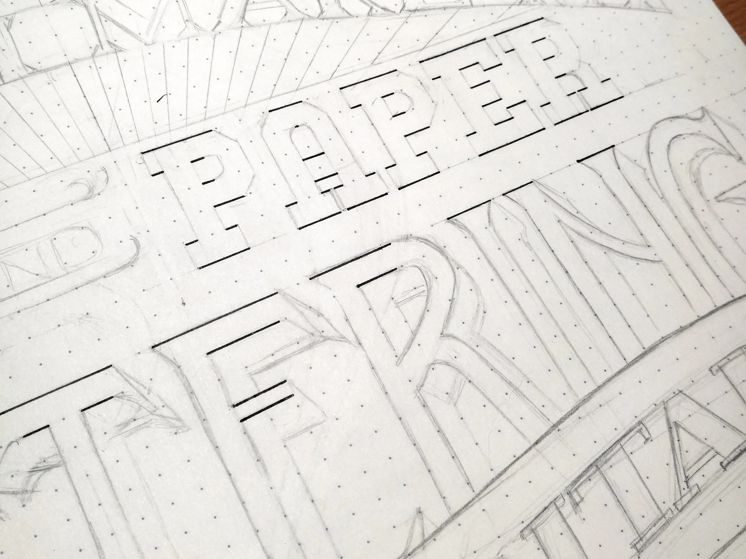
Use a damned ruler.
Your ruler is the single greatest tool at your disposal - I'm not kidding. Use it to draw all those guidelines I just mentioned. Then, when you're inking, bring that bad boy in first to draw any horizontal lines. All the straight bits that are on the same level get done in one go without moving your ruler (hard to explain, so here's a picture). That makes sure you get insanely precise-looking letters that will be the envy of Instagram.
By Kiki B
Pro tip: if you get those nasty little ink pools/smudges under the edge of your ruler, you're using it wrong. See how it slopes down from a thick middle to a thin edge on one or both sides? That's there for a good reason - flip it upside down to lift the edge of the ruler off the paper a tiny bit and prevent those icky little messes. Some rulers even have a special pen edge which is cut away on the underside, and there are those wooden rulers with the metal edge - which, you'll notice, is also raised off the paper. Mind blown, right?
Remember that old adage "Measure twice, cut once?"
Well, it applies here, too. Sketch each word out quickly on scrap paper to determine its size, shape, and approximate center so you don't run out of space at the end of a line or end up with words in places you don't want them - because then if you want to fix it you'll have to draw it all over again, and we all know nobody wants to do that. Pro tip: tracing is the analog version of Ctrl+C. It's totally ok to draw each word separately on extra paper and then trace them onto your finished layout so you can position them perfectly with minimal effort. Tracing isn't cheating when it's your work.
Take your time inking.
There's seriously no rush (unless you're on a deadline, in which case, cut corners elsewhere but don't rush your inking).
Straight bits get done first with your ruler for maximum neatness. Then connect any curves to the straight lines - much easier than trying to line up a ruler to attach a straight line to an existing curved one. Your curves should be a series of teeny tiny strokes - it's much easier and smoother than doing a whole line in one go.
If you're using a brush pen or ink and a brush to fill larger areas, don't feel weird about taking the extra time to outline the area in pen first - it'll save you a lot of stress and potential messes, especially if you're not super confident with a brush yet.
Use thick outlines. Start them thin, then gradually build up using small penstrokes. This gives you the opportunity to smooth over any wobbles and make your lines look super sharp. Bonus: thicker outlines show up better in photos and look more professional as well.
When all your ink is done, touch up. Take your white gel pen and cover up any uh-oh moments - jagged bits, ink blots, wonky curves, etc. White ink is rarely the same color as your paper, but that's ok - when you edit your photo it will blend right in and no one will be the wiser.
Finally, photography and editing.
This is where some serious magic happens. You don't have to be a professional photographer, make amazing flatlays, have an army of daylight lamps and softboxes, or get a really expensive camera. Your phone's camera is just fine.
You'll want some bright light (daylight is best, but I can't tell you how many times I've had to photograph in the middle of the night) and if you can use a couple of softer light sources, you'll avoid having a lot of sharp shadows or bright glare on your artwork. Holding a large sheet of white paper up against a light source will diffuse it nicely so you'll get soft, even lighting. If you have one of those adjustable arm desk lamps, point it up at the ceiling to reflect the light all around when it's photo time.
Editing is the really crucial bit, but again, you don't need anything fancy. Your phone and Snapseed (free photo editing app) will do nicely. Some tips for getting the best results:
Stick mostly to adjusting highlights, shadows (low values give you a nice deep black), warmth (keep this adjustment small!), and saturation. Sometimes you'll have to do it a few times to get the results you want. There are plenty of times where Highlights +100 just isn't enough.
Use the Brush tool to brighten up darker areas by selecting Exposure +0.3 and building up gradually. I start with a large area, hit OK and then repeat several times while making the brush area smaller with each progressive edit. This way you avoid getting a sharp line dividing a brighter and a darker area.
If you're new to editing like this, be patient with yourself. It just takes a little practice.
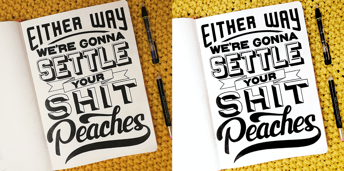
If you don’t believe editing is that crucial, these will change your mind. I haven’t exaggerated the before shots in any way - this is exactly how they’re shot.

By Kiki B
By Kiki B

By Kiki B
I learned so much from this post, holy crap! Snapseed? Had never heard of that! Lettering large? I had a feeling I should bail on my small sketchbook but kept pushing that thought to the back of my mind and then would get frustrated that no one could see the amount of detail on my Instagram pics! GAH! Duh!
Thank you so much Kiki, for teaching us such valuable skills! Go and follow her if you’re not already, she is a rockstar! (@the.kiki.b)