
As I research all of these questions, I'm noticing a pattern: typography is not as black and white as I once thought! Spurs are definitely in the gray area, that is, at least MEDIAN spurs. Spurs are "actually the piece that extends from the curve in a letter. The best examples of these are the top and bottom of the "C" and "S". Spurs are smaller than serifs and beaks, which makes this one of the smallest typography terms." (Source: https://www.freelancer.com/community/articles/define-typography-20-typography-terms-you-must-know)
So Median Spurs are the pointy doo-dads in the middle of the stems (Stem definition) and bowls (Bowl definition).

From what I've gathered, the term "Median Spur" is not used by everybody. There was an entire Typophile.com thread I found where people were discussing what to call said "doo-dads". Here's the list for kicks and giggles...
- Lateral Spurs
- Thorns
- Tuscan Bulges
- Tuscan Flourish
- Diamond Thingies (lol)
- Interlocation Spur
- Interposition Spur
- Lateral Thorn
- Bilateral Spur
- Broadside Thorn
So what is the origin of these "diamond thingies"? They're most closely associated with Western Type (hence the desert scene I did in the spurred letters of my piece) but they first appeared in a very different location: France! "By the end of the seventeenth century... gone are the irrelevancies of calligraphy, replaced instead by the spurs, beaks, serifs and terminals of modern typography. ...when a committee of French academics was convened to study the formation of the perfect roman letter." "Louis XIV incorporated this committee into the Académie des Sciences, the council he organized for the staggering undertaking of recording for posterity an account of all the realms of human endeavor, the first of these engravings became the conceptual basis for a new series of types made for the exclusive use of the crown: cut by Phillipe Grandjean beginning in 1694, these are the romains du roi, the King’s romans." (Source: https://www.typography.com/fonts/didot/history/).
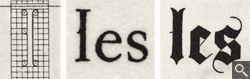
One of the most conspicuous characters in the romain du roi was the spur halfway up the left side of the lowercase L! "This flourish has calligraphic credentials, appearing on the stem of all ascenders in the gothic lowercase in both written and printed form." (Source: https://www.typography.com/fonts/didot/history/).
"So strong were this detail’s connotations that the ‘spurred L’ was preserved for generations by typefounders who served the French crown." (Source: https://www.typography.com/fonts/didot/history/). While we can see that the median spur on the 'L' was created waaaay before Western type, I couldn't find if median spurs were plopped on other letters too. There was a discussion about the origin of median spurs on Reddit where a user says the style is called Tuscan and it originates from wood type in the later half of the 1800's. Maybe median spurs for the other 25 letters excluding 'L' did originate from wood type but I can't confirm or deny it and I kind of doubt it (merp!). Trying to find information on these bad boy ornaments proved difficult. I hope to be able to buy Rob Roy Kelly's book "American Wood Type: 1828-1900" someday and maybe that'll help clear things up for us.
So if there's not a lot of information on the "diamond thingies", how do we know how to use them? The best advice I have is to just experiment. I know, I know, I hate that answer too. But I found this list of typefaces with median spurs and they're all over the place! Some have diamond spurs, some have curved spurs that definitely look more like thorns or a wave. Some have just lines, some have concave squares, some have bifurcated serif things (WTF is bifurcated?! Click here!) And that's just the spur shape itself! Some typefaces have the spurs on the outside of the bowl and on the inside of the counter. (My 2 cents would be if your typeface is condensed, don't put the median spurs in the counter—it diminishes legibility.) Aaanyway, you get my point. These median spurs are slippery as far as rules go but hell, just have fun with them. They're small but they pack a punch when you use them in your hand-lettering. :)
xoxo,
Kelsey